Thursday 19 November 2009

Letterforms

Over the summer holidays we were asked to collect letterforms. I collected mine from magazines, shopping bags, leaflets, internet etc. At college we then got in groups and had to arrange the our letterforms collectively in some sort of order. We chose to do it alphabetically and in size order. We arranged them visually in a spiral effect, like a galaxy, never ending and infinite just like letterforms. This is an ongoing collection and is not finished as yet, the page needs to be filled up more, but you get the general visual effect.


Wednesday 11 November 2009

No News Is Good News - Fruit Cakes

PART 1 RESEARCH

As part 1 of this brief I had to produce a body of research based upon a headline in a newspaper bought on SATURDAY 17th OCTOBER. I chose the article below because I thought it was humorous and ridiculous.


Concept
Fruit cakes - kids told to look at treat but not eat it. Nine year old brought in home baked cake for her birthday and was told she could not eat or share it because it didn't conform with the rules and regulations about health eating with the school.


Ideas

1. Look at healthy eating within schools.
2. Look at cake calories and the healthiness of buns.
3. Recipes for healthy baking.
4. Treats alternatives.
5. Why to eat healthy - issues.
6. Political correctness.
7. Health and Safety.
8. Meeting in the middle, compromise.
9. Laws and ridiculous laws.
10. Hypocrites.


3 Ideas to research further

Healthy eating - What is good for you? Healthy eating schemes. Why do you healthy eat? What are calories? Why thing are bad for you. Effects of eating bad. Is the a healthy cake?
Good will gone bad - Things intentionally meant for good but not perceived right. mistakes, Crossed wires.
Ridiculous laws and health and safety regulations - Stupid laws that no one has heard of banning unnecessary things. Health and safety gone power crazy.


I then had to chose one subject which I though was best and that I wanted to carry through into the next part of the brief. Being kept in the dark about what our next task was made it hard to decide what subject to chose. In the end I chose to focus on ridiculous health and safety and laws because I felt I had the most research on it and it interested me the most.

I looked at things health and safety ban, which came up with some ridiculous finds. Banning of mistletoe at christmas work parties incase of encouraged sexual harassment and the banning of making daisy chains at a school because of the risk of picking up germs from the flowers. I also looked at how stories are dramatised in the newspapers to make the health and safety organisation seem bonkers, some stories are even completely made up and the opposite of the truth. I looked at laws as well. I had heard of a few weird laws that are completely useless. For example in York, it is legal to murder a Scotsman within the ancient city walls, but only if he is carrying a bow and arrow. It is illegal to die in the Houses of Parliament.

In relation to the research work I wrote a statement of fact and opinion.

Statement of fact: Since the Health and Safety at work act was introduced, the number of deaths caused by work have fallen by 75%.

Statement of opinion: Many laws once made for effect are out of context today and many ridiculous laws are not even known by the public.

'It is illegal to die in the Houses of Commons'


PART 2 MESSAGE AND INTERPRETATION

As part 2 of this brief I was to produce designs for a set of three high impact posters that deliver a personal identified message derived from my research in part 1. The posters were restricted to the use of two colours plus stock and produced in a 2:1 format in A3 scale. One poster should use only image, one only text and the other use both text and image.

I decided to focus on the ridiculous health and safety restrictions today. I had to think about creating a instantly communicating, memorable yet simple design. Focusing in on what I am trying to say to the audience without creating vague generalisations. What am I trying to say, is it a statement, deliverance of facts or a question?

Initially we had to draw 10 images, 10 symbols, write 10 verbs and 10 adjectives that relate to the subject in hand. This helped to focus my mind the subject and what I could create from it.


I was interested in safety and warning signs and how impersonal yet authoritative they are. They are very clear and simplified. This could be useful for my image poster because the images are self explanatory and don't need text to explain the instruction.


Here are some of my ideas for the three posters. I wanted to create a sign which showed the radical health and safety regulations today. I also wanted to show the opposite perspective of how the newspapers dramatise health and safety stories to give them a bad name.


This above idea emphasises how ridiculous health and safety regulations are. Showing that next they will get us not to speak, move or breathe. I wanted to make it look like a real warning sign so used yellow and black.
Below I looked at the statistic, 'deaths have dropped in the work place by over 75% since the Health and Safety in work act came into action'. I used ladders in the top image as a play on words 'fallen'. I wanted the text poster to look interesting because there are quite a lot of words being used, so I used different fonts and styles to make it look more interesting to read.


I liked the idea of using a sign to show a message.

DON'T BREATHE

Short and snappy. Quite a shocking thing to ask someone not to breathe so it catches your attention. Using the sign research and ideas sheets I created some design ideas on illustrator. I needed to create a symbol which represented not breathing. Looking at what the face looks like when holding breath and interpreting this with existing sign symbols.


The sign only shows features on the face that are relevant to the instruction.


My final idea:


However, in the crit certain things came to light which needed to be amended. The gradient on the signs didn't fit the brief because it used more than two colours plus stock. The black edge on the sign is hard to see because the background almost black so it gets lost so maybe the use of white would help visibility and readability. Using the colour red was suggested in stead of yellow. The fact that there is a box round the text on the text poster means that it doesn't fit the brief of a purely text poster. Also using capital letters might make it more high-impact.I tried to address all off these issues so that my posters fit the brief.


ABOVE: I don't think the red really worked and I the grey background makes the page look dull, less eye-catching and less high-impact. I like the white background however, I think it gives it a clean look whilst still being eye-catching.
BELOW: I think the images look better now there is no gradient and it fits the brief. By taking the box away it puts more focus on what the poster actually says. I don't think it improves the look by using capital letters because it makes it look less like the font used on a sign.


My final poster designs:

I chose to remove the black background on the text and image and the image posters because it emphasised the signs more. Using both yellow and white on the text poster helped to emphasise specific words and it also fitted the colour scheme.


PART 3 MESSAGE AND DELIVERY

Part three of the brief was to 'produce a mail shot that distributes, disseminates and reinforces my message to an appropriate list of recipients'. I was given an envelope as a template for the size requirements (114mm x 162mm) but I could chose how it opened, folded, what was inside etc. I had to make 10 editions of my resolution accompanied by a visually appropriate mailing list. My designs again had to use only two colours plus stock and one of the envelopes was to be delivered to Leeds College to make sure it worked in the post.

First I focused on 'what' I was communicating, 'why' I was communicating it, 'who' was I communicating it to and 'how' I was going to do it:

What? Ridiculous health and safety rules and regulations, strong instructing tag line
Why? Picking fun at health and safety. Informing others that health and safety is ridiculous these days and they are worrying too much.
How? Fold out re-sealable envelope with flyers slotted inside developed from posters.
Who? Health and safety head quarters, government, high risk work places, unions for workers.
Inform/instruct/persuade/promote? Inform
Format? Re-useable envelope, three posters with info sheets and written explanation of what I am informing.
Colour/stock? Yellow and black, tracing paper.

I decided to create my mailing list at the beginning so that I could keep referring back to keep on track and in unison with who I was sending the mail shots to. I chose people and companies such as:

Health and safety organisations because they should be aware how other people perceive their work.
Newspapers because they write many headlines about health and safety gone mad.
Workers unions because they can help regulate work environments.
Prime minister because it is his word that could calm down health ad safety rules and regulations.


I decided to use tracing paper because of the fact we were only allowed to use two colour plus stock and I though it would give another dimension to the piece also you would be able to see slightly through the envelope whilst it was still closed, which would intrigue people more to see what was inside. I thought because I was going to use tracing paper it would be nice for the envelope to be re-useable.

I looked at some existing packaging and envelopes in books to get inspiration for my own designs:

This design I think looks very clean cut and factory made, this would fit in well with my designs style.

I like the way this envelope is incorporated into this design ad how it folds out to be something useful, not just a big poster.


I love this design, it is very interesting and although you can see everything through the packaging I am still intrigued to open it to see what's inside.


This packagings contents looks very delicate and secretive due to the bubble wrap used. It has a very plain exterior with simple stickers giving little bits of information about what's inside simple but effective design.


The use of frosted plastic here ties in well with my idea of using tracing paper. The envelope itself is very plain, but the fact the contents is partly visible adds to the design.


Looking at existing packaging gave me some ideas of my own for how my design could look, fold-out, contents, usability:


Taking into consideration the tracing paper, address space, flaps, paper size, printing cost, durability, impact, overall impression.


I also started to look at what I wanted to have inside the design and how it would look in relation to the envelope. Because I was using tracing paper every flap and would would be visible through the layers, so I had to consider weather the flaps would be straight or curved, how long the flaps would be.


I came up with the idea of lazor cutting out letters on the envelope, which wouldn't use up an ink, but would create a depth and make the envelope more interesting. Also I thought about the weight of the tracing paper, because it is quite thin and fragile, using a heavier weigh would increase durability, but I would then not be able to print onto it, hence the lazor cutting.

Below is a tester envelope with three inserts which layered together crete on image. Using tracing paper here was very delicate, confirming my concern with weight issues.


Half way through the project I presented my work so far to a small group to see how they thought my idea was coming along; the feedback is below:


I experimented with different fastenings because my envelope was going to be re-useable, it would have to fasten on its own without the use of glue. Some of my findings are below:


After many experimentations and alterations I came up with my final designs for the envelope and inserts. I used the poster designs, bust changed them slightly so they would layer together well. I wanted the inserts to work together as a whole image, but when separated they would work as well. Leaving a border either side of the poster inserts left a gap for the flaps to be folded in without being in the way of the text and room to put the address by the side. I decided to write the address on a separate piece of tracing paper because then it could be thrown away once the letter was received and opened. Cutting out of the address had to be precise so that it would line up perfectly with the side border. I also wanted to include two pages of info on 'stories and myths' of health and safety and a little information about what the letter was about.


For the envelope I decided to keep the lines simple and sleek and I didn't want there to be loads of holes for flaps to be slotted for fastening because it looks messy. A simple slot running across the fold would be hard to see but an effective fastener while being delivered. Also keeping the flaps square and the same width of the envelope ensured it would create less visible lines.


Final envelope pictures


CLOSED


FASTENING FLAP


OPEN


HELD UP TO THE LIGHT


INSERTS LAYERED


STORIES AND MYTHS INFO SHEETS


FINISHED ENVELOPE AND INSERTS


Friday 6 November 2009

Visual Language Colour 3/11/09, 10/11/09, 17/11/09


3/11/09 This week we looked at colour theory and how it is all down to perception. We looked at the different ways colours are made and viewed.

Light is made up of the three primary colours (RGB) which mix together to create all the other colours (secondary and tertiary). All of these colours mixed together creates white because it is an additive colour making it brighter as colours are added and is used for tv and CRT monitors.


Inks have different rules, they use CMYK and are subtractive. When the colours are put together they get darker and eventually with all the colours mixed together create black.

Chromatic Values: Referring to the lightness or darkness of the hue of a colour. Adding white to a hue produces a high-value colour (tint). Adding black to a hue produces a low-value colour (shade).

Hue - hue spectrum
Luminance - brightness
Tint - pale or white, low chromatic, high luminance
Black + white - same chromatic value (0)
Tones - dullness of a colour, neutrals
Saturated - high chromatic, can't get any bluer, greener, redder, etc.
Colour relies on what's going on around it.

Intensity: Also known as saturation is the brightness of a colour. You can change the intensity of a colour by adding grey. You can also change the intensity by adding the colours compliment, this would be known as a 'tone'. Mixing complimentary colours together produces a dull tone. However if you put the complementary colours side by side this increases their intensity.

In our group we all collected 10 red items and had to line them up in an order. We chose to order them in blue-reds to orange-reds. Below are some pictures of our composition.


Below are the other groups colour compositions.


Next we were introduced to the wonders of Pantone and using the colour books had to match 5 chosen red objects to the corresponding Pantone colour. Being universally known makes it very useful, but the sheer amount of colours available is slightly bemusing when trying to make decisions on what to chose.


10/11/09 This week we looked at the relation between colours and how environment and perception play a big part in what a colour looks like.

The lower the contrast between colours, the lesser the legibility.

Contrast of saturation - Formed by the juxtaposition of the light and dark values and their relative saturations.

Contrast of extension - Formed by assigning proportional field sizes in relation to the visual weight of a colour. Also known as contrast of proportion.

Contrast of temperature - Formed by juxtaposing hues that can be considered 'warm' or 'cool. Also known as the contrast of warm and cool. (Orange warmest, blue coolest).

Complementary contrast - formed by juxtaposing complementary colours from a colour wheel, opposite colours are complementary.

Below is a colour wheel I have created using all of the classes collection of colours.


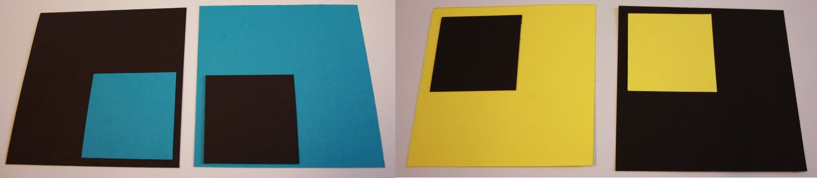
We next had to use coloured paper and two complimentary colours to see the relation and changes in the colours when seen against different backgrounds and contexts. Were the colours bolder, lighter, more saturated?

The black makes the greens seem more muted and calm. The red, being its complimentary, brings out the green and makes it very vivid. Blue and green work together quite well making the green seem clam. The orange makes the green almost sink into the page, and gives a muggy tinge to it, the green makes the orange look more red. The yellow overpowers the green. It makes the colour green stand out and yet looks quite fresh and well matched. The green on green helps to emphasise all the different tomes of green, some greens are made to look more lime and others more muggy or bluey. The middle four represent strong colour contrast against a coloured background.


The yellow and the red both stand out well together almost as if they are both fighting to be noticed more. The green card makes the red objects appear very red, like a royal deep red. Red on red helps to emphasise the different shades red has, giving some a purple tinge and others an orangey sheen. The orange makes the red object look more orange. The black makes the red look flat and pure. The blue brings out the purples in the red objects and makes them vibrant and eye boggling to look at.


17/11/09 This week we looked at how colours can affect what we think of something. What colours make you want to read a sign, what colours are a warning, would the colour of something ultimately decide if you use it or not?? ...

Black absorbs colour and so on the left here it is dulling down the blue and puling it back, on the second on the left the black is almost creating an hole as the black looks like it is set back from the page. The same applies with the yellow and black. The yellow is slightly overpowering on the left, whilst the black mutes the colour on the right.


Red and blue on black work well together. When red and blue are together they over power each other being very vibrant and almost seem to light up. With the black added it absorbs some of the colour to make it more soft and easier on the eye. Seeing white with blue makes you think of fresh and clean. This would work for a company such as a dentist. If you add red, it adds a sense of danger and isn't so appealing.


Primary and secondary colours work well together. Placing the orange with yellow and red looks good because any primary colours with their secondary colour will neutralise the colours. White always adds a clean cut look to things when added, black darkens the colours. When placing black and red together, it darkens the red to almost a burgundy. Having just two colours eg. red and yellow, orange and yellow, red and orange, one of the colours is more bold and vivid. The red saturates the orange, the yellow mutes the orange.


Red and blue mean danger. I find it hurts my eyes when I look at them together for a long time. The edges can blend together. Would be quite hard to read some text using these colours.


Green and blue are not effective when put together because they are too close to each other on the colour spectrum. Green and white projects freshness and cleanliness, the green looks bright. Whereas green and black look dirty, the green looks dirty and muggy now. Black and white together shows trust. Clean cut and sharp edges.


Now using lines we looked at how they sit and look next to each other. Red and blue are very vibrant and dangerous looking. Green and blue aren't very effective together because they don't contrast enough. Black and yellow show a warning. Putting the blue and yellow on black card makes them stand out more than on white paper.


Arrows are a universally recognised symbol and therefore is very powerful. The colours work in the sam way here. Some colours making you want to obey the sign, blue and yellow, yellow and red, whilst others give of a warning or a command, red and black, green and black.