Sunday 14 February 2010

Collection 100 part 1, 2 and 3


'Process is more important than outcome'

Ideas generation:

15 objects I find interesting:
  1. Patterned fabrics
  2. ribbon
  3. shoes
  4. pens
  5. photos
  6. lights
  7. notebooks
  8. apples
  9. vintage objects
  10. t-shirts
  11. books
  12. boxes
  13. money
  14. puzzles
  15. buttons.
15 subjects I find interesting:
  1. Crafts
  2. fashion
  3. photography
  4. extraordinary people
  5. culture
  6. music
  7. interior decoration
  8. the universe
  9. crime
  10. celebrities
  11. graphic design
  12. philosophy
  13. overheard conversations
  14. fashion illustration
  15. travel.
15 places/environments that I find interesting:
  1. Space
  2. remote places - desert/jungle
  3. jails
  4. eiffel tower
  5. Madame Tussauds
  6. theme parks
  7. car parks
  8. ocean
  9. Grand Canyon
  10. Hollywood
  11. Area 52
  12. garage
  13. bedroom
  14. pub
  15. country side
15 people that I find interesting:
  1. Brother
  2. Lady Gaga
  3. Simon Cowell
  4. Alan Carr
  5. Obama
  6. Cheryl Cole
  7. Parents
  8. Parkinson
  9. Rusell Brand
  10. Hitler
  11. E.T
  12. Best friend
  13. Michael Jackson
  14. Jonny Depp
  15. Mike Mcintire.
From this list I selected 'shoes' as a subject to concentrate and research over the christmas holidays.

Part one -
Produce a body of work that investigates the term/concept/value/number 100 by collecting, recording, documenting and categorising.

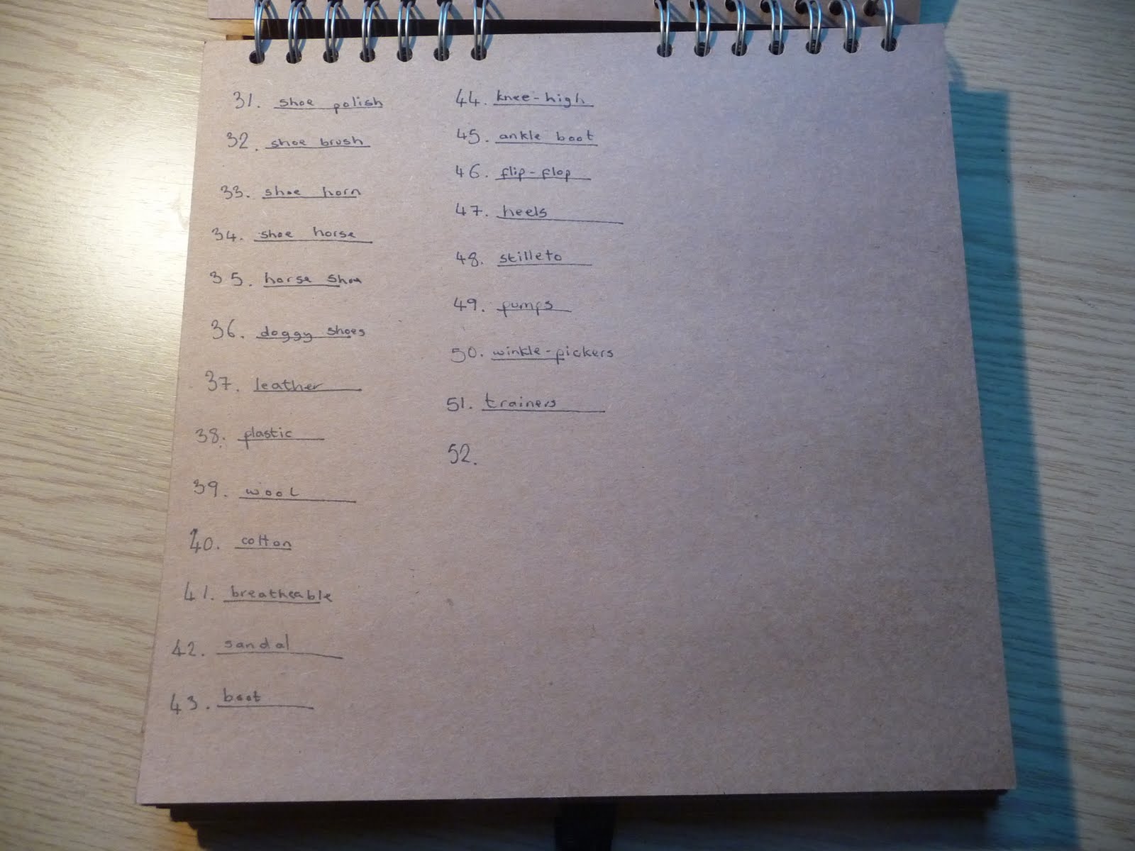
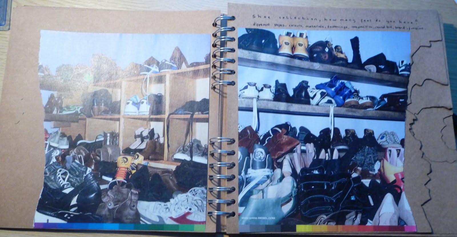
100 facts, 100 opinions, 100 objects...ABOUT SHOES

100 facts:


100 objects:


100 opinions:


Presentation of christmas research:
Subject matter: Shoes
Themes of research within subject matter: Style, popularity, purpose, history.
Themes to be developed: Purposes of shoes, persona created by shoes, history of the shoe, shoe styles.
Issues raised: More visuals.
Methods for categorising research: style, fastenings, brand, identity, materials.
Additional research required: What shoes say about people, dog shoes, foot prints, fashion of shoes now and through the past 100 years, re-occurring fashions.
Action to be taken: Look at taking information from a more specific area in shoes.


Final development and Final idea : Advertisement for new shoe brand launch. This will include a mini chocolate shoe inside a mini shoe box with information leaflet about the new brand and were it will be being launched and sold. Gift to be given out at a launch event.


Looking at shoes in their place of sale online and on shops.


Photo shoot for shoe box and leaflet.


Experiment with ribbon to fasten the gift box.


Chocolate shoes being made and packing of the 100 shoes.


Leaflet design ideas.


Final product.


Crit - feedback:
Issues raised: Why is there 100 shoes, is it limited edition? 100 first customers could get the shoes, is every box different, for example a different colour bow on each shoe box, numbered boxes? tissue inside box to make look nice. Chocolate market is always luxurious.
Action to be taken: Clarify content in categories and quantities. Test different ideas out for shoe packaging and chocolate packaging, look at existing companies, hotel chocolat and harvey nichols.


Final presentation crit feedback:
Is there and evening event for the shoes to be given out at? - Yes it will be given out at a launch event.
Lose the photographs of the shoes and legs and keep it clean cut.
Exclusive event with vip ticket only, have to pay for event ticket? Event tickets will be for respected customers and other retailers that will potentially buy these shoes at stock for their store.
Brand to same corporate identity as Harvey Nichols? Launching in a luxury store such as Harvey Nichols will give the brand a high class reputation. Maybe if it actually went into production I would have to change the final product to include the Harvey Nichols logo and company typeface.


Photography Elective

Brief:
Produce a set of photographic prints which represents the theme ' A SENSE OF PLACE'


PHOTOGRAPHY ELECTIVE,

A SENSE OF PLACE

EVALUATION


For this project I started off by looking at the brief title ‘A Sense of Place’ literally and by taking photos of the environment, scenery and buildings and how they are the place themselves. I visited Amsterdam and whilst there I took images of famous landmarks, traditional items related to that culture; clogs and bikes were the two most prominent. These items then created the ‘sense of place’.


I also went home to York and looked at a sense of place within the ancient city walls. I photographed in churches as well, which I think created a very good sense of place and you can almost feel the calming atmosphere inside a church within the images. I started looking at depth of field as well, and looking at how blurring out sections of the photographs (objects far or close to the lens) this could completely change what is being shown and portrayed in the images.


Not being great at remembering all the settings and controls on cameras I decided to mainly use automatic settings. Changing them just in the surroundings, for example, using the landscape setting outdoors would automatically set it to a small aperture and a large depth of field, ensuring that everything was in focus and also enhancing greens and blues.


After looking at the more structural and atmospheric side I decided to focus more emotionally on the ‘sense of place’ and how, not taking the briefings wording so literally. I looked at the sense of place within a person. Looking at existing photographers helped me understand how emotion can be portrayed through a photograph. I researched Oliver Vander Heyden, a fashion photographer who liked his work to show a story though the use of emotion, set, and great lighting. His work is very fake and, like the fashion business, made to look beautiful. I don’t really like the idea of knowing that the emotion is fake.


I also stumbled across a website called ‘Phatz Photography’ who, among a wide range of projects, have a large set of raw emotional photos. Real emotion as it happens, which I think creates a much more enjoyable image and an all round more interesting and believable image. This work I have interpreted by trying to capture raw emotion giving the images depth.


The work of Inez Van Lamsweerde intrigued and inspired me the most and in particular their collection ‘ expose bodies yet hide true feelings’. This work showed images of naked bodies where the subject had covered their face with their hands. Faces are painted on their hands expressing artificial emotions. I find it is a weird mix of styles, looking at the openness of how they are exposing their bodies and on the other hand suppressing their true emotions behind their hands. Why are they so free to expose their bodies, which is seen as very daring, yet hide their face, the focal point of all emotion?


I wanted to recreate an image of questionable emotion. Making people question weather the emotion is real or fake for the camera. Photographers such as, Joseph Nicephore Niepce and Frances Frith used to be thought of as an ‘invisible eye’ capturing events exactly as they happened and recording the truth. However photography can distort reality and document a moment in time never to be captured again with the potential to be absolutely fake.


The images a took I wanted to be portrait like from a passport photograph and so I chose a plain white background and plain clothing. I used the portrait setting on the camera which would give a wide aperture, focus on the foreground and enhance skin tones.


For my final piece ‘sense of place’ I have decided to focus on one persons emotions. Inspired from Inez Van Lamsweerde I want to pose the question, ‘Is emotion real?’ and create a sense of knowledge of the place in that persons life. I chose to photograph portraits of a friend Simon because I though he would feel at ease and project real emotions, but also these could be overshadowed by the fact there is a camera in front of him; enhancing the meaning of the final piece, weather his emotions are real or not, and capturing his place in time. My final piece was landscape. I chose to do this because I thought it would be visually more stimulating as the eye reads across. I am happy with my final piece. It captures what I wished to capture; emotions huddled together posing questions of truth and place in someone life.


Final image


Design Process - Software Workshop Photoshop

The brief was to produce a set of ten double-sided A6 postcards that explore the colour RED using PDF presentation. The postcards must exist as part of a set or series. Here is what I came up with... I wanted to keep things simple avoiding cliche photoshop tools so I just decided to focus on faming of the images using a lot of zoom and tweaking the brightness, contrast, saturation.