Name: Robyn Francesca Makinson
Age: 19
Home town: Wigan
Likes all film genres
Hates alot of things
Realist rather than a dreamer
No aspiration per say
Hates interviews
Hates speaking about herself, nothing to say
Pet hates - loud speakers
Arrogant people
Over the top personalities
Hates dance
loves 60s music and 50's grease - hairstyles leather jackets, diners.
people who have too many opinions and broadcast them aloud to others.
hot weather
travelling in cars with other people
small talk
working after midnight
fashion trends, especially ridiculous ones
cooking
meeting new people
waking up early
people who are on twitter, i dont care what theyre doing every second of the day
flying
dubstep, really anything with bass.
I'm just a pessimist in general so you name something and i could put a negative twist on it. a good quote i like to use is: 'hell is other people.'
theres not many forms of graphic design I don't like but in terms of general art i'm not interested in modern art. anything conceptual and i'm confused, theyre obvious but people like damien hirst and tracy emin. anything in that genre.
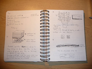
From my interview with Robyn I gathered that there were a lot of things she doesn't like. Possibly more than things that she does like. So from here I thought I would create a spread about things that Robyn hates, a quite light hearted joke at how negative she looks at things. I thought about doing it bright pink with girlie fonts and swirley hand writing - the opposite of Robyn - but then I opted for a more neutral and playful style here is some of my development work and final design below.

Girlie light colour with flowing fonts and curled patterns.
Block colour - bold and in you face - Robyn would hate it!
More of a messy feel - expressing hatred and anger. Experimentation with brushes.


Chosen style:
I wanted the final design to look quite scribbled, to express anger and hatred. The neutral colour keep the design looking formal, whilst the actual message is quite light hearted. I am quite please with m final design. It wasn't how I pictured the design to be when I sat down and had the initial interview with Robyn, however I am happy with how my ideas and designs have progressed to reach the final design.


