Friday, 9 April 2010

What is a Line?

“A line is a dot that went for a walk. ”

- Paul Klee


For this project I had to answer the question 'What is a Line?'. A very open question and one that has become very challenging to answer throughout this project. Some initial ideas exploring the idea of line are below.

Mark indicating position, connection or boundaries

Boundaries positions and connections between countries.


Boundary showing property.


Boundaries drawn on the road to give cars position.


A connected series of events, actions or developments.

The evolution of man showing development.


Connected cogs create an action together.
A series of books show a series of events.


A formation of people, objects or things on besides/behind the other.

Crowd shows people on/besides/behind one another.


Match stick all together inside a match box.


Messy office shows objects on top/behind on another.


From this initial research I decided to focus on the statement: A formation of people, objects or things on besides/behind the other. Within this I chose to focus on hair.


Book Fair - A Guide To a Houseproud Housewife


This project was to create a book to be sold in a book fair. The theme had to relate back to previous sessions where I focused on plug sockets. At first I found it very hard and uninspired by the subject. But then I thought about appliances which would be plugged into the sockets. I then went on to think about the work by Linder 'Pretty Girl Series':


This work looks at femininity and also the contrast of technology. Using this style I wanted to create a book on the prefect housewife. Collaborating femininity, technology and humour. Focusing on appliances which could be plugged in I took photographs of a friend dressed in 1950's style clothing using appliances such as the iron, kettle, toaster etc. I then got images from 1950's homes and imposed her into these scenes. Getting inspiration from birthday cards and merchandise I found whilst shopping I wrote quirky little phrases on each page to create a humourous story:


Here are some existing ideas I have found which reflect the style and era my book will be based on.


I took photos in my flat to include in my book, however the setting was not in keeping with the theme so I used existing images taken from books and photoshopped the two images together to create the desired effect.


Below is my final book design:


Photography - Colour and Lighting

We had a session with one of the college photography tutors where we learnt the ins and outs of photography. In this session we were to produce a set of images which experimented with colour. We were to use the coloured objects we had collected, mine being red. I looked at using colour to change colour. By placing coloured paper against the objects it changed their colour intensity. I looked at various coloured backgrounds including complimenting colours and reds.

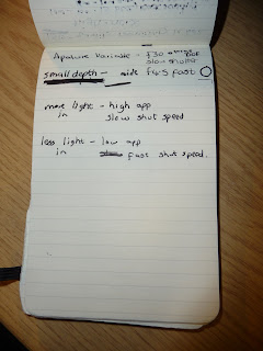
Below are some notes taken during this session and the final result at the bottom. I think it has worked very well. All the colours are very vivid and sharp and there is a clear difference in the appearance of the objects colours when the background is changed.


Placing the red lollipop on a red background gave it a darker brown tone when compared to how much purer red it looks when on an orangey background. This its the same for the red rose and heart ornament. When putting the ribbon and heart ornament together in the top right picture purple is emphasised in the ribbon and pinks and oranges are more apparent in the heart ornament.