Showing posts with label OUGD101. Show all posts

Sunday, 6 December 2009

Illustrator - 26 letterforms


Using one letter from the designed alphabet, in the alphabet soup compress project, I had to design 26 visual variations in Illustrator:


I experimented with effects initially to get a grasp of different things I could create. Then I experimented more with angle, stroke, texture, arrangement, simplicity, fill, colour, remove/add things etc.

Thursday, 19 November 2009

Letterforms

Over the summer holidays we were asked to collect letterforms. I collected mine from magazines, shopping bags, leaflets, internet etc. At college we then got in groups and had to arrange the our letterforms collectively in some sort of order. We chose to do it alphabetically and in size order. We arranged them visually in a spiral effect, like a galaxy, never ending and infinite just like letterforms. This is an ongoing collection and is not finished as yet, the page needs to be filled up more, but you get the general visual effect.


Wednesday, 11 November 2009

No News Is Good News - Fruit Cakes

PART 1 RESEARCH

As part 1 of this brief I had to produce a body of research based upon a headline in a newspaper bought on SATURDAY 17th OCTOBER. I chose the article below because I thought it was humorous and ridiculous.


Concept
Fruit cakes - kids told to look at treat but not eat it. Nine year old brought in home baked cake for her birthday and was told she could not eat or share it because it didn't conform with the rules and regulations about health eating with the school.


Ideas

1. Look at healthy eating within schools.
2. Look at cake calories and the healthiness of buns.
3. Recipes for healthy baking.
4. Treats alternatives.
5. Why to eat healthy - issues.
6. Political correctness.
7. Health and Safety.
8. Meeting in the middle, compromise.
9. Laws and ridiculous laws.
10. Hypocrites.


3 Ideas to research further

Healthy eating - What is good for you? Healthy eating schemes. Why do you healthy eat? What are calories? Why thing are bad for you. Effects of eating bad. Is the a healthy cake?
Good will gone bad - Things intentionally meant for good but not perceived right. mistakes, Crossed wires.
Ridiculous laws and health and safety regulations - Stupid laws that no one has heard of banning unnecessary things. Health and safety gone power crazy.


I then had to chose one subject which I though was best and that I wanted to carry through into the next part of the brief. Being kept in the dark about what our next task was made it hard to decide what subject to chose. In the end I chose to focus on ridiculous health and safety and laws because I felt I had the most research on it and it interested me the most.

I looked at things health and safety ban, which came up with some ridiculous finds. Banning of mistletoe at christmas work parties incase of encouraged sexual harassment and the banning of making daisy chains at a school because of the risk of picking up germs from the flowers. I also looked at how stories are dramatised in the newspapers to make the health and safety organisation seem bonkers, some stories are even completely made up and the opposite of the truth. I looked at laws as well. I had heard of a few weird laws that are completely useless. For example in York, it is legal to murder a Scotsman within the ancient city walls, but only if he is carrying a bow and arrow. It is illegal to die in the Houses of Parliament.

In relation to the research work I wrote a statement of fact and opinion.

Statement of fact: Since the Health and Safety at work act was introduced, the number of deaths caused by work have fallen by 75%.

Statement of opinion: Many laws once made for effect are out of context today and many ridiculous laws are not even known by the public.

'It is illegal to die in the Houses of Commons'


PART 2 MESSAGE AND INTERPRETATION

As part 2 of this brief I was to produce designs for a set of three high impact posters that deliver a personal identified message derived from my research in part 1. The posters were restricted to the use of two colours plus stock and produced in a 2:1 format in A3 scale. One poster should use only image, one only text and the other use both text and image.

I decided to focus on the ridiculous health and safety restrictions today. I had to think about creating a instantly communicating, memorable yet simple design. Focusing in on what I am trying to say to the audience without creating vague generalisations. What am I trying to say, is it a statement, deliverance of facts or a question?

Initially we had to draw 10 images, 10 symbols, write 10 verbs and 10 adjectives that relate to the subject in hand. This helped to focus my mind the subject and what I could create from it.


I was interested in safety and warning signs and how impersonal yet authoritative they are. They are very clear and simplified. This could be useful for my image poster because the images are self explanatory and don't need text to explain the instruction.


Here are some of my ideas for the three posters. I wanted to create a sign which showed the radical health and safety regulations today. I also wanted to show the opposite perspective of how the newspapers dramatise health and safety stories to give them a bad name.


This above idea emphasises how ridiculous health and safety regulations are. Showing that next they will get us not to speak, move or breathe. I wanted to make it look like a real warning sign so used yellow and black.
Below I looked at the statistic, 'deaths have dropped in the work place by over 75% since the Health and Safety in work act came into action'. I used ladders in the top image as a play on words 'fallen'. I wanted the text poster to look interesting because there are quite a lot of words being used, so I used different fonts and styles to make it look more interesting to read.


I liked the idea of using a sign to show a message.

DON'T BREATHE

Short and snappy. Quite a shocking thing to ask someone not to breathe so it catches your attention. Using the sign research and ideas sheets I created some design ideas on illustrator. I needed to create a symbol which represented not breathing. Looking at what the face looks like when holding breath and interpreting this with existing sign symbols.


The sign only shows features on the face that are relevant to the instruction.


My final idea:


However, in the crit certain things came to light which needed to be amended. The gradient on the signs didn't fit the brief because it used more than two colours plus stock. The black edge on the sign is hard to see because the background almost black so it gets lost so maybe the use of white would help visibility and readability. Using the colour red was suggested in stead of yellow. The fact that there is a box round the text on the text poster means that it doesn't fit the brief of a purely text poster. Also using capital letters might make it more high-impact.I tried to address all off these issues so that my posters fit the brief.


ABOVE: I don't think the red really worked and I the grey background makes the page look dull, less eye-catching and less high-impact. I like the white background however, I think it gives it a clean look whilst still being eye-catching.
BELOW: I think the images look better now there is no gradient and it fits the brief. By taking the box away it puts more focus on what the poster actually says. I don't think it improves the look by using capital letters because it makes it look less like the font used on a sign.


My final poster designs:

I chose to remove the black background on the text and image and the image posters because it emphasised the signs more. Using both yellow and white on the text poster helped to emphasise specific words and it also fitted the colour scheme.


PART 3 MESSAGE AND DELIVERY

Part three of the brief was to 'produce a mail shot that distributes, disseminates and reinforces my message to an appropriate list of recipients'. I was given an envelope as a template for the size requirements (114mm x 162mm) but I could chose how it opened, folded, what was inside etc. I had to make 10 editions of my resolution accompanied by a visually appropriate mailing list. My designs again had to use only two colours plus stock and one of the envelopes was to be delivered to Leeds College to make sure it worked in the post.

First I focused on 'what' I was communicating, 'why' I was communicating it, 'who' was I communicating it to and 'how' I was going to do it:

What? Ridiculous health and safety rules and regulations, strong instructing tag line
Why? Picking fun at health and safety. Informing others that health and safety is ridiculous these days and they are worrying too much.
How? Fold out re-sealable envelope with flyers slotted inside developed from posters.
Who? Health and safety head quarters, government, high risk work places, unions for workers.
Inform/instruct/persuade/promote? Inform
Format? Re-useable envelope, three posters with info sheets and written explanation of what I am informing.
Colour/stock? Yellow and black, tracing paper.

I decided to create my mailing list at the beginning so that I could keep referring back to keep on track and in unison with who I was sending the mail shots to. I chose people and companies such as:

Health and safety organisations because they should be aware how other people perceive their work.
Newspapers because they write many headlines about health and safety gone mad.
Workers unions because they can help regulate work environments.
Prime minister because it is his word that could calm down health ad safety rules and regulations.


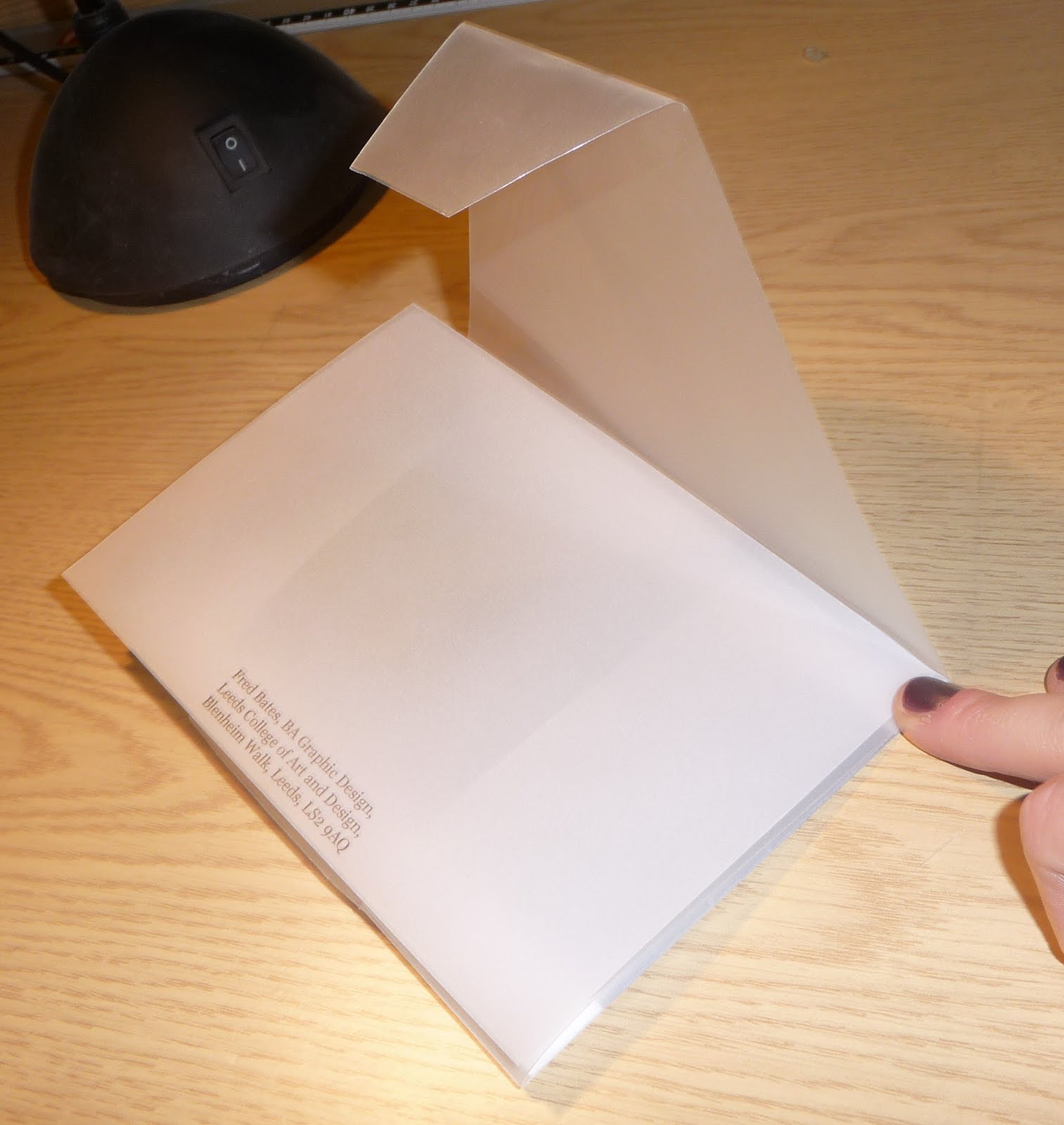
I decided to use tracing paper because of the fact we were only allowed to use two colour plus stock and I though it would give another dimension to the piece also you would be able to see slightly through the envelope whilst it was still closed, which would intrigue people more to see what was inside. I thought because I was going to use tracing paper it would be nice for the envelope to be re-useable.

I looked at some existing packaging and envelopes in books to get inspiration for my own designs:

This design I think looks very clean cut and factory made, this would fit in well with my designs style.

I like the way this envelope is incorporated into this design ad how it folds out to be something useful, not just a big poster.


I love this design, it is very interesting and although you can see everything through the packaging I am still intrigued to open it to see what's inside.


This packagings contents looks very delicate and secretive due to the bubble wrap used. It has a very plain exterior with simple stickers giving little bits of information about what's inside simple but effective design.


The use of frosted plastic here ties in well with my idea of using tracing paper. The envelope itself is very plain, but the fact the contents is partly visible adds to the design.


Looking at existing packaging gave me some ideas of my own for how my design could look, fold-out, contents, usability:


Taking into consideration the tracing paper, address space, flaps, paper size, printing cost, durability, impact, overall impression.


I also started to look at what I wanted to have inside the design and how it would look in relation to the envelope. Because I was using tracing paper every flap and would would be visible through the layers, so I had to consider weather the flaps would be straight or curved, how long the flaps would be.


I came up with the idea of lazor cutting out letters on the envelope, which wouldn't use up an ink, but would create a depth and make the envelope more interesting. Also I thought about the weight of the tracing paper, because it is quite thin and fragile, using a heavier weigh would increase durability, but I would then not be able to print onto it, hence the lazor cutting.

Below is a tester envelope with three inserts which layered together crete on image. Using tracing paper here was very delicate, confirming my concern with weight issues.


Half way through the project I presented my work so far to a small group to see how they thought my idea was coming along; the feedback is below:


I experimented with different fastenings because my envelope was going to be re-useable, it would have to fasten on its own without the use of glue. Some of my findings are below:


After many experimentations and alterations I came up with my final designs for the envelope and inserts. I used the poster designs, bust changed them slightly so they would layer together well. I wanted the inserts to work together as a whole image, but when separated they would work as well. Leaving a border either side of the poster inserts left a gap for the flaps to be folded in without being in the way of the text and room to put the address by the side. I decided to write the address on a separate piece of tracing paper because then it could be thrown away once the letter was received and opened. Cutting out of the address had to be precise so that it would line up perfectly with the side border. I also wanted to include two pages of info on 'stories and myths' of health and safety and a little information about what the letter was about.


For the envelope I decided to keep the lines simple and sleek and I didn't want there to be loads of holes for flaps to be slotted for fastening because it looks messy. A simple slot running across the fold would be hard to see but an effective fastener while being delivered. Also keeping the flaps square and the same width of the envelope ensured it would create less visible lines.


Final envelope pictures


CLOSED


FASTENING FLAP


OPEN


HELD UP TO THE LIGHT


INSERTS LAYERED


STORIES AND MYTHS INFO SHEETS


FINISHED ENVELOPE AND INSERTS


Wednesday, 21 October 2009

Alphabet Soup 5th-16th October


An Alphabet for Brady Miller

This project involved creating a hand rendered alphabet that describes the personality/character of another student from the class. My parter was Brady Miller; I interviewed her to find out more about her so I could best represent her in my alphabet.

Interview with Brady Miller:

What is your earliest memory?
Grabbing hold of my mums leg at play group because I didn't want her to leave.

Which living person do you most admire, and why?
Tash, my best friend, because she is so individual and crazy. She doesn't care what anybody thinks.

What is your most treasured possession?
My teddy, called Rosie.

What would your super power be?
To be able to go back in time.

Who would play you in the film of your life?
My best friend, Tash.

Who would you invite to your dream dinner party?
The whole of the 'Friends' cast.

What makes you unhappy?
Being in hospital.

What would be your fancy dress costume of choice?
An extravagant fairy.

Which words or phrases do you most overuse?
"OH NO!"


Brady also showed me a website called extra-oomph.com, the blog of an artist called Linda Zacks. She said she personally loved her work and the style she worked in.

From this interview I picked out four words (which either described her or the way in which I wanted to work) that I would focus on to help me create the alphabet:

1. Girly
2. Floral
3. Messy
4. Extravagant


The brief was to manipulate an existing font, so I wanted to pick an already extravagant, decorative font to portray her girlie side, and so that I could manipulate it with inspiration from Linda Zacks style to portray the chosen words 'messy' and 'extravagant'.

I chose the font 'chopin script', which I found on 'dafont.com' :


I decided to use uppercase letters because they were more extravagant and I thought they would create a better overall feeling.

I sketched out some ideas, using mainly pen and ink and water colour paints. Some images were directly inspired by Linda Zacks, whilst others were ideas I wanted to explore.

Below are some general ideas of different strokes and techniques I could use (neat outline, swirly design, rough splodged effect, etc.)


I tried out some floral designs because Brady has a tattoo of a rose on her back.


A design from Zacks Adobe blog page
I tried to replicate her design but without using collage materials because this project had to be hand rendered. I used pen and ink, oil pastels and pastels.


I love the style of this piece by Linda, it is very messy with ink dripping down but the image is still clear.


I tried to incorporate the letters into the same style with ink dripping down.


Looking more at neutral colours and focusing on the natural shape of the letters still with the messy and unpredictable style of Linda Zacks.


The environment by Linda Zacks

Wild, uncontrollable, a mix of thoughts within the image, colourful, provokes interest to examine deeper


Brady's favorite colour is pink so I tried pink water colour to see how it looked against a white background. I don't think it is as effective as using black ink.


Test of my skills of drawing roses. Not very successful.


I wanted the finished affect to be very hand drawn and not precise, so I drew out the letter form and designed with in and around it, using styles already tried and tested.


I think the gold leaf makes it stand out more. Elegant gold contracting against harsh, bold black.


Experimentation with pink, Brady's favourite colour. Not as visually appealing.


Looking at symbols and layering. Layering wouldn't work because it doesn't adhere to the brief, but I like the effect of the different opacities.


The typeface that I chose didn't have a '£' symbol, so I designed my own. Some of my ideas are below. I looked at swirls and lengths of the symbol, letter weight, whilst keeping it tied in with the chopin script.


I decided to use pen and ink to form the outline of the letters. I just wanted the outline because then I could fill it in with colours etc. I used gold leaf, pink and yellow oil pastel and water colour. Yellow symbolises the pollen on the flowers. Gold gives the image a more eye catching finish. Pink is used for the girly look. Ink splodges for messy and Linda Zacks inspired. Scribbles are Linda Zacks inspired for effect. Little object like wand, tiny details relating back to the interview. Big ink splodges randomly placed expressing crazy and not caring about anything. I wanted to do a lot of experimental work before hand, however I wanted my final piece to be a one off. Because of the style I was going for it is very spur of the moment and individual, with the ink splodges they just wouldn't come out the same every time. So taking everything into consideration and setting basic outlines of what I was going to do helped create the effect I wanted.

FINAL PIECE


NAME TAG