http://www.dontpaniconline.com/
For the competition we were to design a poster which represented the word VOGUE. In college we created three visual variations of the designs to then pick one to submit online. Here are my poster designs:

Elegance mixed with chaos.
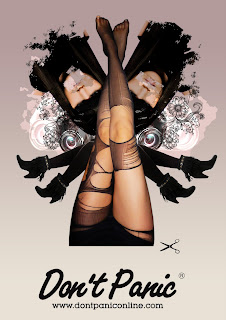
I used photoshop to blend together images taken by myself. The top image of the woman its taken from a vogue magazine. Images layered over the top of each other create a look of confusion and complexity. Ripped tights represent the outrageous fashion trends and how they are used and re-used over time.

Madonna song loose link with mess and faceless models. This image shows beauty, trend and style. The caption 'c'mon vogue' relates to the Madonna song as a loose connection with ever changing fashion and music. Trend is represented with the body of the model slowly being cut away and being lost, showing how trends come and go and are just lost with time. The face has been covered on the models face to show how fashion is a very cut-throat industry and as trends come and go models are expected to do their job and go.

Simple pretty design mirror and definition of vanity. Not a very complex idea or design but just simply illustrates how vogue relates to beauty which relates to vanity. The mirror is left clear because you are what you see yourself as. The use of the black ink and brown paper is to keep the idea simple and just to notice the message. Subconsciously the brown paper could make people think of natural beauty and the irony between fashion and natural, which are normally opposites.
Initial 30 ideas: magazine, model face, desire, parties, elegant, catwalk, fashion, Madonna, photo shoot, elaborate, camera, flash, feminine, make-up, photography, celebrity, frills, heels, size 0, aspire, straight face, editor, dresses, pain, Naomi Campbell, floaty, designer, expensive, pose, feminine.
5 chosen ideas: catwalk, clean cut, trend, elaborate, make-up.
Personal brief: Design three posters aimed at students and music lovers. Focusing on the word VOGUE but not taking it too literally. Speaking with a quirky, interesting, light-hearted, engaging manner. Look into high fashion and the meaning behind VOGUE. Register on to the don't panic website. Posters should be submitted in JPEG format and less than 2MB file size.
CONCEPT, IDEAS, RESEARCH, RESOLUTION scotch egg...
concept - vogue don't panic poster.
ideas - catwalk, elaborate, clean cut, trend, make-up
research - dontpaniconline.com, streets, online shops, catwalks, books, shop windows, existing trends, past trends, style icons, music and fashion combined, internet, innovative clothing design, magazines.
resolution - three don't panic poster ideas.
three images that inspired my final poster designs:
Photoshoot - legs, vanity, vogue pose, fashion pose, cover girl, style, attitude...

Poster design ideas:
Simple layout and colour test. Background is too harsh and doesn't work visually. I like the shape of the legs and the fan effect work well.
Neutral pinky colour works better for the background. Fan of legs are too overwhelming now.
Looks better and more interesting with more going on. Legs look better now and still give fan effect. Layers and transparency add more to the background.
Introduction of floral design. Too much floral. Needs to be smaller or more opaque.
Flowers work better muted and smaller. Image of woman work well upside down to show confusion and style. Using brushes I have erased sections of the image of the woman to give a weathered and used feeling.
Feedback from poster crit:
What concept/statement/fact/question/tone is being communicated? (this might not what was intended).
Madonna, vanity, fashion, glamour representing fashion, what is it actually about? vanity in fashion.
Is this being communicated effectively?
Meaning is clear and not too deep, clear it is focused on fashion, yes clear and effective, some have less of a message, but it is bold and engaging, the brown paper works really well!
Have the posters answered the brief?
Yes, in the fashion sense, it gets it's ideas across well, all three posters refer the the brief, very obvious related to fashion/vogue.
Who is the audience - have they been addressed?
Female young adults, addressed well through visual style, fashion based students, quite feminine, very feminine, particularly the mirror poster the other two could be more unisex as they are bolder, young fashionable girls.
Strengths:
Poster on brown paper is really good and simple, love the illustrations of flowers on the poster with legs, clear message, strong visuals, good use of font on mirror poster, type and image work well in all posters, clean simple design for mirror poster, layout - mish mash effect of images, vanity definition.
What could be developed further?
The vanity poster is quite plain, maybe replace don't panic with vanity definition? less branding more message, different stock for vanity poster, variations of layout for each poster, experiment with background for mirror poster - perhaps use floral design from other poster.


No comments:
Post a Comment